GESSO
GESSO is a community-oriented app for a variety of art-based events.
Project
Academic
Timeline
4 months
Role
UX/UI Designer
Tools
Figma, Draw.io, Adobe Photoshop
Overview
Prompt
Prompt
Small, unconventional, temporary art events don’t receive the same attention from the public as museums and galleries. This decreases the viewership pool for local artists’ work, and deprives art appreciators from expanding their horizons.
Small, unconventional, temporary art events don’t receive the same attention from the public as museums and galleries. This decreases the viewership pool for local artists’ work, and deprives art appreciators from expanding their horizons.
Conducting User Research
Conducting User Research
For user research, I used quantitative research methods by creating a survey. I shared this survey with my target audience - those interested in the visual art scheme, whether as hobbyists or for work. After analyzing the results, I noticed the following insights:
For user research, I used quantitative research methods by creating a survey. I shared this survey with my target audience - those interested in the visual art scheme, whether as hobbyists or for work. After analyzing the results, I noticed the following insights:
Being able to see a wide variety of art at one location matters
People have stylistic and medium-specific preferences
People appreciate varying types of art events, including pop-ups, markets, etc.
Community is important to those in the visual art space
User Interview
Interviews & Surveys
Interviews & Surveys
I created an interview guide to facilitate interviews, and interviewed five different individuals and used empathy maps to code the data, with sections on what the participant says, thinks, does, and how they feel. I later used affinity diagramming to sort the data by similar findings. I supplemented my qualitative research with quantitative research through a survey, in which I got 19 responses. This led to new driver insights.
I created an interview guide to facilitate interviews, and interviewed five different individuals and used empathy maps to code the data, with sections on what the participant says, thinks, does, and how they feel. I later used affinity diagramming to sort the data by similar findings. I supplemented my qualitative research with quantitative research through a survey, in which I got 19 responses. This led to new driver insights.
Defining & Ideation
Personas
Personas


User Journey Map
User Journey Map
This depicts the process of a potential user, starting from them facing a problem associated with my app, using it, and the results afterward. I made two journey maps, one for an art appreciator, and one for secular artists trying to widen their viewer circle.
This depicts the process of a potential user, starting from them facing a problem associated with my app, using it, and the results afterward. I made two journey maps, one for an art appreciator, and one for secular artists trying to widen their viewer circle.


Prototyping
Wireframes/Iterative Design
Wireframes/Iterative Design
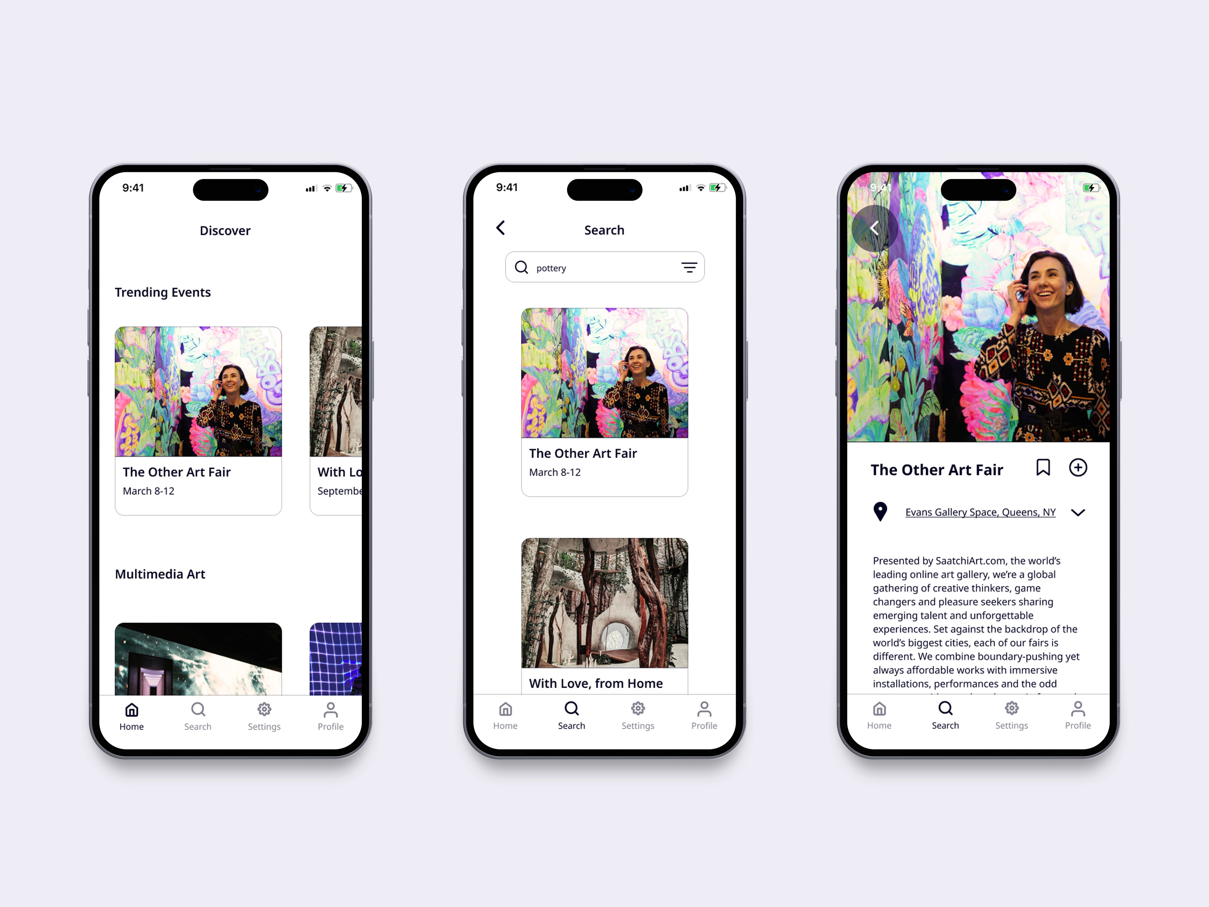
After creating mid-fidelity wireframes for all three flows, I created parallel designs of the primary flow. Based on feedback in usability sessions, the home page of the primary flow was best-received. Additionally, the Search Results page 2 of the second parallel flow was better received compared to the same page of the original primary flow. So, I combined the successes of each flows into an updated flow:
After creating mid-fidelity wireframes for all three flows, I created parallel designs of the primary flow. Based on feedback in usability sessions, the home page of the primary flow was best-received. Additionally, the Search Results page 2 of the second parallel flow was better received compared to the same page of the original primary flow. So, I combined the successes of each flows into an updated flow:


High-fidelity Design/More Iterations
High-fidelity Design/More Iterations
I created another parallel design for the high fidelity homepage. The homepage version on the right was more successful in usability testing as users said the events “look like tabs you can click on.”
I created another parallel design for the high fidelity homepage. The homepage version on the right was more successful in usability testing as users said the events “look like tabs you can click on.”

Making My App Accessible for All Users
Making My App Accessible for All Users
I aimed to make my designs inclusive for those specifically with cognitive disabilities. Cognitive disabilities include delirium, ADHD, a learning disability, and many more. Typically, these users may encounter problems focusing and need reminders throughout the mobile experience. They are also more likely to benefit from simplified language. Keeping these topics in mind, I included the following in my app:
I aimed to make my designs inclusive for those specifically with cognitive disabilities. Cognitive disabilities include delirium, ADHD, a learning disability, and many more. Typically, these users may encounter problems focusing and need reminders throughout the mobile experience. They are also more likely to benefit from simplified language. Keeping these topics in mind, I included the following in my app:
Instead of using placeholder text, which goes away once the user starts typing, I used form fields. This way, the user will always see what input information is required of them rather than having to delete what they've typed to see the original placeholder text.
Instead of using placeholder text, which goes away once the user starts typing, I used form fields. This way, the user will always see what input information is required of them rather than having to delete what they've typed to see the original placeholder text.

I also decreased cognitive load by including a drop-down menu on the event details page. This allows users to only see more information about an event if they wish.
I also decreased cognitive load by including a drop-down menu on the event details page. This allows users to only see more information about an event if they wish.

Reflection
Final Thoughts + Next Steps
Final Thoughts + Next Steps
This was the first time I did such a thorough literature review, which took much longer than expected. However, doing such a thorough review allowed me to truly understand how anticipatory anxiety and avoidance behaviors work, and how to best help users. In the future, I plan to add:
• Accessibility features to make the product more inclusive
• Implement Flat Design 2.0 standards to improve accessibility